Sosyal Bi̇li̇mler
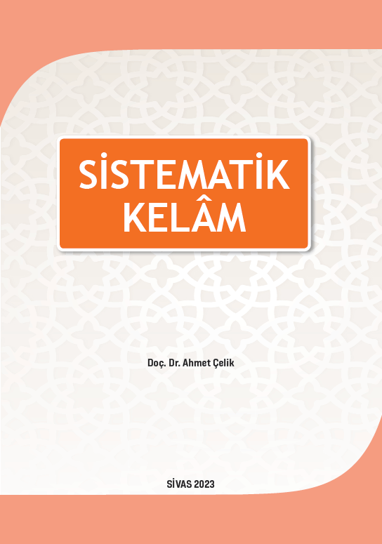
Sistematik Kelam 2. Baskı
Yazar

STOKTA YOK
150.00 ₺
Yayın Bilgileri
Yayın Yılı:
2023
ISBN:
9786256497146
Yayın Tipi:
Basılı
Dil:
Türkçe
Yayınevi:
Cumhuriyet Üniversitesi Yayınları
Baskı Bilgisi:
2. Baskı
Sayfa Sayısı:
268 sayfa
Yayın Hakkında
Kelâm ilmi dinin inanç alanı ile ilgilenir. İslam inancının İslam’ın ilk devirlerinden itibaren günümüze kadar akıl-nakil ilişkisi içerisinde ele alınış biçimi kelâm ilminin temel konusudur. Sistematik kelâm ise bu konuları belirli bir sistem içerisinde tarihsel gelişimine uygun olarak ele alan bir alt başlıktır. Elinizde bulunan bu kitap da Sistematik Kelâm türü kitaplara bir örnek teşkil etmektedir.
Sistematik Kelâm kitabına öncelikle bu ilmin tanıtımı ile başlamanın uygun olacağından hareketle kelâm ilminin tarihsel serüveni ile başlamayı uygun gördük. Ardından Kelâm ilminde metodolojiyi ifade etmesi anlamında hükümler ve çeşitlerini, istidlâl ve yöntemlerini, varlık ve bilgi konularını vermeye çalıştık. Kitapta klasik kelâm konularının ele alınışı bu konuların ardından iman konusuyla devam etti. İman konusu imanın Müslüman olmanın ilk şartı olması ve ahkâmın bunun üzerine bina edilmesinden dolayı ana konularda ilk sırayı aldı. İmanın devamında Ulûhiyet ünitesi iki ünite şeklinde ele alındı. Ulûhiyet: “Marifetullah ve Allah’ın Sıfatları” ve “Allah’ın Varlığı ve Sıfatlar Etrafından Gelişen Konular”. Bu konunun iki üniteye dağılmış şekilde ele alınmasının sebebi, konunun kelâm ilminde en geniş hacmi tutan başlık olması nedeniyledir. Ulûhiyet ünitesinin ardından kaza-kader ünitesi, kulların ve Allah’ın fiillerinin ilişkisi ile birlikte Allah’ın sıfatlarının devamı olarak ele alınmıştır. Uluhiyet-kaza-kader ünitelerinin ardından nübüvvet, Melekler, ölüm ve ahiret, hilafet ve imamet üniteleri sırasıyla işlenmiştir. Böylece bu kitabın isminde bulunan sistematiği, hicri ikinci yüzyıldan itibaren gelişen bu ilmin ana konularının klasik kitaplarda bulunan şeklinin sentezi oluşturmaktadır. Kitap toplam on dört üniteden oluşmaktadır.
İçerisinde bulunduğumuz çağ itibariyle inancın ve akıl-nakil ilişkisinin doğru anlaşılmasının ne kadar önemli olduğu ortadadır. Elinizde bulunan bu kitapla bu anlam arayışına bir nebze olsun katkıda bulunmayı hedefledik. Eksikliklerin tarafınızca beşerî yönümüze atfedilmesi istirhamımızdır. Başarıya ulaştıran Yüce Allah (c.c.)’dır. O’ndan bu kitabı sadaka-i câriye kabilinden kılmasını ve okuyucuların en yüksek fayda ile faydalanmasını niyaz ediyorum. En nihayetinde ilmi ile âmil olmayı hem yazara hem de okuyuculara nasip eylesin…
Aynı Kategoriden Diğer Yayınlar
STOKTA YOK
100.00 ₺
STOKTA YOK
600.00 ₺
STOKTA YOK
200.00 ₺
Yazarın Diğer Yayınları
STOKTA YOK
50.00 ₺
STOKTA YOK
50.00 ₺