Sosyal Bi̇li̇mler
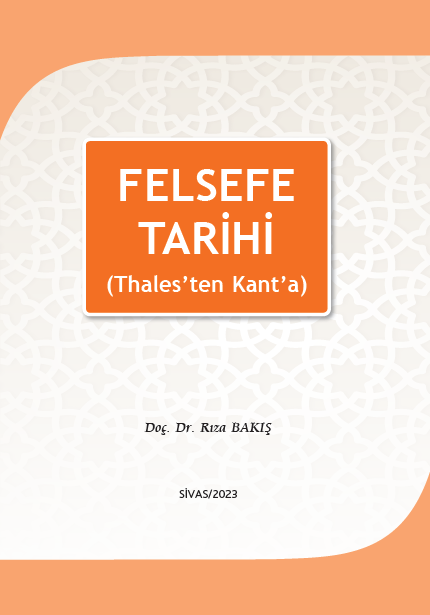
Felsefe Tarihi 2. Baskı (Thales’ten Kant’a)
Yayınevi:
Cumhuriyet Üniversitesi Yayınları
Felsefe Tarihi dersleri ilahiyat fakültelerinde zorunlu olarak okutulan ders kategorisindedir. İsimlendirmeler son zamanlarda bazı fakültelerde farklılaşmış olsa da içerik değişmemiştir. Önceki yıllarda İlkçağ Felsefesi ve Yeniçağ Felsefesi şeklinde olan bu adlandırma yeni dönemde Felsefe Tarihi I ve Felsefe Tarihi II şeklinde olmuştur.
Sonradan ihdas edilen ve adları İlahiyat Tamamlama Programı (İLİTAM) şeklinde kurgulanan programlarda YÖK’ün tasarrufu ile Felsefe Tarihi dersleri birincisi sınıfın bahar dönemi programında yer almaktadır. Ders içeriği de İlahiyat fakültelerindeki İlkçağ ve Yeniçağ Felsefesi derslerininin içeriğini kuşatacak şekilde tasavvur edilmiştir.
İLİTAM programlarının pratiğine ilişkin birçok eleştiri mevcuttur. Kimileri bu programların ilahiyat eğitiminin ruhunu vermekten uzak görmekte ve yetersiz bulmaktadır kimileri ise bütünüyle karşı çıkmakta ve devamında fayda görmemektedir. Bir gerçek var ki o da bu programlar öyle ya da böyle devam etmektedir.
Esasında bu programlarda ders materyalini matbu bir şekilde öğrencilere verme zorunluluğu bulunmamaktadır. Ancak bazı fakülteler programda yürütülen eğitimleri biraz daha disiplinize etmek ve sistematik yürütmek kaygısıyla elektronik ortamlarda da paylaşılan metinleri matbu bir şekilde öğrenciye ulaştırmayı tercih etmektedir.
Bizim oluşturmuş olduğumuz metin de öğrencinin kaynak temininde karşılaşabileceği güçlükleri gidermek kaygısıyla hazırlanmıştır. Dersin anlaşılmasına katkı sağlayacağını ümit ettiğimiz bu metin, öğrencilere felsefenin temel yaklaşımlarını kavramada ve kazandırmada umarız yardımcı ve yararlı olur.
×
/* Action Buttons */
.action-buttons {
display: flex;
flex-direction: column;
gap: 1rem;
}
.modern-action-btn {
background: linear-gradient(135deg, #dc3545 0%, #c82333 100%);
color: white;
padding: 1rem 2rem;
border-radius: 12px;
text-decoration: none;
font-weight: 600;
font-size: 1rem;
text-align: center;
border: none;
transition: all 0.3s cubic-bezier(0.4, 0, 0.2, 1);
box-shadow: 0 4px 16px rgba(220, 53, 69, 0.2);
display: flex;
align-items: center;
justify-content: center;
gap: 0.75rem;
}
.modern-action-btn.secondary-btn {
background: linear-gradient(135deg, #6c757d 0%, #5a6268 100%);
box-shadow: 0 4px 16px rgba(108, 117, 125, 0.2);
}
.modern-action-btn:hover {
transform: translateY(-2px);
box-shadow: 0 8px 24px rgba(220, 53, 69, 0.3);
color: white;
text-decoration: none;
}
.modern-action-btn.secondary-btn:hover {
box-shadow: 0 8px 24px rgba(108, 117, 125, 0.3);
}
.auth-buttons {
display: grid;
grid-template-columns: 1fr 1fr;
gap: 1rem;
}
.auth-notice .notice-card {
background: linear-gradient(135deg, #17a2b8 0%, #138496 100%);
color: white;
padding: 1rem 1.5rem;
border-radius: 12px;
display: flex;
align-items: center;
gap: 0.75rem;
font-weight: 500;
box-shadow: 0 4px 16px rgba(23, 162, 184, 0.2);
}
.notice-icon {
font-size: 1.25rem;
flex-shrink: 0;
}
/* Info Cards */
.info-card {
background: white;
border-radius: 16px;
box-shadow: 0 4px 16px rgba(0, 0, 0, 0.08);
border: 1px solid #e9ecef;
overflow: hidden;
transition: all 0.3s ease;
}
.info-card:hover {
transform: translateY(-2px);
box-shadow: 0 8px 24px rgba(0, 0, 0, 0.12);
}
.info-card .card-header {
background: linear-gradient(135deg, #dc3545 0%, #c82333 100%);
color: white;
padding: 1.25rem 1.5rem;
border-bottom: none;
}
/* Combined Content Styling */
.combined-content {
display: flex;
gap: 2rem;
align-items: flex-start;
}
.info-section {
flex: 0 0 40%;
min-width: 300px;
}
.description-section {
flex: 1;
background: #f8f9fa;
border-radius: 12px;
padding: 1.5rem;
border: 1px solid #e9ecef;
}
.description-title {
color: #2c3e50;
font-weight: 600;
font-size: 1rem;
margin-bottom: 1rem;
display: flex;
align-items: center;
}
.info-grid-compact {
display: grid;
grid-template-columns: 1fr;
gap: 1rem;
}
.card-title {
margin: 0;
font-weight: 600;
font-size: 1.1rem;
display: flex;
align-items: center;
gap: 0.75rem;
}
.card-icon {
font-size: 1.25rem;
opacity: 0.9;
}
.card-content {
padding: 1.5rem;
}
.info-grid {
display: grid;
grid-template-columns: repeat(auto-fit, minmax(250px, 1fr));
gap: 1.5rem;
}
.info-item {
display: flex;
flex-direction: column;
gap: 0.5rem;
}
.info-label {
font-weight: 600;
color: #2c3e50;
font-size: 0.9rem;
text-transform: uppercase;
letter-spacing: 0.5px;
}
.info-value {
color: #6c757d;
font-size: 1rem;
}
.type-badge {
padding: 0.375rem 0.75rem;
border-radius: 20px;
font-weight: 600;
font-size: 0.8rem;
text-transform: uppercase;
letter-spacing: 0.5px;
}
.type-dijital {
background: linear-gradient(135deg, #17a2b8 0%, #138496 100%);
color: white;
}
.type-ikisi {
background: linear-gradient(135deg, #28a745 0%, #20c997 100%);
color: white;
}
.type-fiziksel {
background: linear-gradient(135deg, #6c757d 0%, #5a6268 100%);
color: white;
}
/* Description */
.description-text {
font-size: 1rem;
line-height: 1.8;
color: #495057;
text-align: justify;
}
/* Social Share */
.social-share {
text-align: center;
background: #f8f9fa;
border-radius: 16px;
padding: 1.5rem;
border: 1px solid #e9ecef;
}
.share-title {
color: #2c3e50;
font-weight: 600;
margin-bottom: 1.5rem;
font-size: 1.1rem;
}
.share-buttons {
display: flex;
justify-content: center;
gap: 0.75rem;
flex-wrap: wrap;
}
.share-btn {
padding: 0.75rem 1rem;
border-radius: 50px;
text-decoration: none;
font-weight: 600;
font-size: 0.9rem;
transition: all 0.3s cubic-bezier(0.4, 0, 0.2, 1);
display: flex;
align-items: center;
gap: 0.5rem;
border: 2px solid transparent;
position: relative;
overflow: hidden;
}
.share-btn.facebook {
background: linear-gradient(135deg, #3b5998 0%, #2d4373 100%);
color: white;
}
.share-btn.twitter {
background: linear-gradient(135deg, #1da1f2 0%, #0d8bd9 100%);
color: white;
}
.share-btn.whatsapp {
background: linear-gradient(135deg, #25d366 0%, #20ba5a 100%);
color: white;
}
.share-btn.email {
background: linear-gradient(135deg, #6c757d 0%, #5a6268 100%);
color: white;
}
.share-btn:hover {
transform: translateY(-3px);
box-shadow: 0 6px 20px rgba(0, 0, 0, 0.15);
color: white;
text-decoration: none;
}
/* Related Products Section */
.related-products, .author-products {
background: linear-gradient(135deg, #f8f9fa 0%, #e9ecef 100%);
}
.section-header {
text-align: center;
}
.section-main-title {
color: #2c3e50;
font-weight: 700;
font-size: 2rem;
margin-bottom: 0.5rem;
display: flex;
align-items: center;
justify-content: center;
gap: 1rem;
}
.section-main-title .section-icon {
color: #dc3545;
font-size: 1.75rem;
}
/* Products Grid for Related */
.products-grid {
display: grid;
grid-template-columns: repeat(auto-fill, minmax(280px, 1fr));
gap: 2rem;
padding: 0;
}
.products-grid .product-card {
background: white;
border-radius: 16px;
overflow: hidden;
box-shadow: 0 4px 16px rgba(0, 0, 0, 0.08);
border: 1px solid #e9ecef;
transition: all 0.4s cubic-bezier(0.4, 0, 0.2, 1);
}
.products-grid .product-card:hover {
transform: translateY(-6px) scale(1.02);
box-shadow: 0 12px 32px rgba(0, 0, 0, 0.15);
}
.products-grid .product-image {
height: 260px;
overflow: hidden;
background: #f8f9fa;
position: relative;
}
.products-grid .product-image-actions {
position: absolute;
top: 12px;
right: 12px;
z-index: 5;
opacity: 1;
}
.products-grid .btn-view-detail {
display: inline-flex;
align-items: center;
justify-content: center;
width: 40px;
height: 40px;
background: rgba(0, 0, 0, 0.6);
border: none;
border-radius: 50%;
font-size: 1rem;
color: white;
text-decoration: none;
transition: all 0.3s ease;
}
.products-grid .btn-view-detail:hover {
transform: scale(1.1);
background: rgba(220, 53, 69, 0.9);
color: white;
}
.products-grid .product-image img {
width: 100%;
height: 100%;
object-fit: contain;
padding: 1rem;
transition: transform 0.3s ease;
}
.products-grid .product-info {
padding: 1.25rem;
}
.products-grid .product-title {
margin-bottom: 0.75rem;
}
.products-grid .product-title a {
color: #2c3e50;
text-decoration: none;
font-weight: 600;
font-size: 1rem;
line-height: 1.4;
transition: color 0.3s ease;
}
.products-grid .product-title a:hover {
color: #dc3545;
text-decoration: none;
}
.products-grid .product-author {
color: #6c757d;
font-size: 0.9rem;
margin-bottom: 1rem;
font-style: italic;
}
.products-grid .stock-status {
background: #d4841a;
color: white;
border-radius: 8px;
padding: 0.75rem 1rem;
display: flex;
align-items: center;
justify-content: space-between;
margin-top: auto;
}
.products-grid .stock-status.out-of-stock {
background: #6c757d;
}
.products-grid .stock-text {
font-weight: 700;
font-size: 0.8rem;
letter-spacing: 0.5px;
}
.products-grid .stock-status .price-info {
display: flex;
align-items: center;
gap: 0.5rem;
white-space: nowrap;
}
.products-grid .current-price {
font-weight: 700;
font-size: 1.1rem;
color: #ffffff;
}
.products-grid .btn-add-cart-inline {
background: #dc3545;
color: #ffffff;
border: none;
width: 42px;
height: 42px;
border-radius: 50%;
display: flex;
align-items: center;
justify-content: center;
font-size: 1.1rem;
transition: all 0.3s ease;
margin-left: 0.5rem;
}
.products-grid .btn-add-cart-inline:hover {
background: #b02a37;
color: #ffffff;
transform: scale(1.1);
}
.products-grid .empty-state-card {
background: white;
border-radius: 16px;
border: 1px solid #e9ecef;
padding: 2rem;
text-align: center;
color: #6c757d;
grid-column: 1 / -1;
}
.products-grid .empty-state-content {
display: flex;
flex-direction: column;
align-items: center;
gap: 0.75rem;
font-weight: 600;
}
.products-grid .empty-state-content i {
font-size: 2rem;
color: #dc3545;
}
/* Responsive Design */
@media (max-width: 768px) {
.product-detail-title {
font-size: 1.5rem;
}
.product-detail-subtitle {
font-size: 1rem;
}
.auth-buttons {
grid-template-columns: 1fr;
}
.info-grid {
grid-template-columns: 1fr;
}
.combined-content {
flex-direction: column;
gap: 1.5rem;
}
.info-section {
flex: none;
min-width: auto;
}
.share-buttons {
flex-direction: column;
align-items: center;
}
.share-btn {
width: 100%;
max-width: 200px;
justify-content: center;
}
.author-card {
flex-direction: column;
text-align: center;
}
.section-main-title {
font-size: 1.5rem;
}
.products-grid {
grid-template-columns: repeat(auto-fill, minmax(250px, 1fr));
gap: 1.5rem;
}
}
@media (max-width: 576px) {
.modern-stock-status {
flex-direction: column;
gap: 1rem;
text-align: center;
}
.current-price {
font-size: 1.75rem;
}
.products-grid {
grid-template-columns: 1fr;
gap: 1.5rem;
}
}
/* Loading and Animation States */
.product-card {
animation: fadeInUp 0.6s ease-out;
}
@keyframes fadeInUp {
from {
opacity: 0;
transform: translateY(30px);
}
to {
opacity: 1;
transform: translateY(0);
}
}
/* Legacy compatibility */
.hover-shadow {
transition: all 0.3s ease;
}
.hover-shadow:hover {
transform: translateY(-5px);
box-shadow: 0 10px 30px rgba(0,0,0,0.15) !important;
}
.main-image-container {
background: #f8f9fa;
padding: 20px;
border-radius: 10px;
}
.badge-lg {
padding: 8px 15px;
font-size: 14px;
}