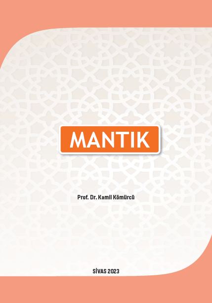
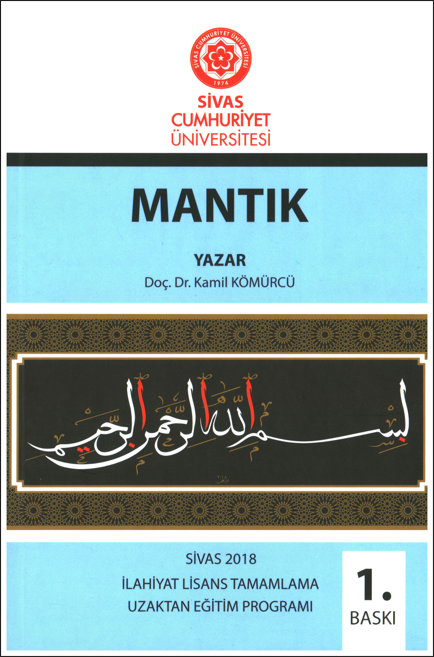
Mantık 2. Baskı
Sosyal Bi̇li̇mler

Mantık 2. Baskı

Yazar
Kamil KÖMÜRCÜ
Kamil KÖMÜRCÜ
STOKTA
3 adet
150.00 ₺
Yayın Bilgileri
Yayın Yılı:
2023
ISBN:
9786256497153
Yayın Tipi:
Basılı
Dil:
Türkçe
Yayınevi:
Cumhuriyet Üniversitesi Yayınları
Baskı Bilgisi:
2. Baskı
Sayfa Sayısı:
188 sayfa
Yayın Hakkında
Mantık, doğru düşünce ile yanlış düşünceyi ayırmaya yarayan alet ilmi olarak kabul edilmiştir. Bunun yanında onu doğru düşünme sanatı, bilinenlerden hareketle bilenmeyenlerin elde edilmesine yarayan bilim olarak niteleyenler de olmuştur.
Düşünme, insanın yaratılışından bu yana sahip olduğu bir yeti olsa da bugüne kadar yapılan bilimsel araştırmalara göre düşünmenin kural ve kaideleri Antik Yunan düşünürleri tarafından sistemli hale getirilmiştir. Doğru düşünmenin ilkeleri zaman içerisinde çeşitli medeniyetlerin, özellikle İslam medeniyetinin katkılarıyla geliştirilerek bir metot çerçevesinde düzenlemiş ve disipline edilmiştir. Müslümanlar, miladi sekizinci yüzyılda karşılaştıkları mantık bilimini bütün detaylarıyla inceleyip, onun üzerine devasa çalışmalar yapmış bu ilmi, “ilimlerin ilmi” mertebesine yükseltmişlerdir.
Elinizdeki bu çalışma, Cumhuriyet Üniversitesi İlahiyat Fakültesi Lisans Tamamlama (İLİTAM) programı için hazırlanmış mantık ders kitabıdır. Bu eser daha önce mantık dersi için yazmış olduğumuz ve Cumhuriyet Üniversitesi tarafından iki baskısı yapılmış olan “Klasik Mantık” isimli eser üzerinde yapılan küçük değişikliklerle ortaya çıkmıştır. Her iki eserde de bütün mantık konuları incelendiği için bu iki çalışma arasında büyük farklar yoktur. Çünkü Klasik Mantıkta konular ve onların ele alınış biçimi neredeyse standart hale gelmiştir.
Bu kitapta Aristoteles’e atfedilen ve Organon külliyatı olarak isimlendirilen -bir tanesi Porphyrios’a ait olmak üzere-dokuz kitap ele alınmıştır. Birden çok isimle anılsa de genel olarak bunlar; İsagoci, Kategoriler, Önermeler, Kıyas, Burhan, Cedel, Hitabet, Şiir ve Mugalata olarak olarak sıralanır. Bu dokuz kitap aynı zamanda mantığın dokuz bölümünü oluşturur. Bu bölümler müfredat programının sınırlılıkları göz önünde bulundurularak, özet sayılabilecek tanımlar ve örneklerle incelenmeye çalışılmıştır. Konuların on dört ünite olarak işlenme gerekliliği, üniteler arasında hacim olarak bir orantısızlığı beraberinde getirmiştir. Olabildiğince üniteleri dengelemeye çalıştık, ancak yapıları gereği bazı konular uzun bazıları da kısa kaldı.

Yazarın Diğer Yayınları

/* Action Buttons */ .action-buttons { display: flex; flex-direction: column; gap: 1rem; } .modern-action-btn { background: linear-gradient(135deg, #dc3545 0%, #c82333 100%); color: white; padding: 1rem 2rem; border-radius: 12px; text-decoration: none; font-weight: 600; font-size: 1rem; text-align: center; border: none; transition: all 0.3s cubic-bezier(0.4, 0, 0.2, 1); box-shadow: 0 4px 16px rgba(220, 53, 69, 0.2); display: flex; align-items: center; justify-content: center; gap: 0.75rem; } .modern-action-btn.secondary-btn { background: linear-gradient(135deg, #6c757d 0%, #5a6268 100%); box-shadow: 0 4px 16px rgba(108, 117, 125, 0.2); } .modern-action-btn:hover { transform: translateY(-2px); box-shadow: 0 8px 24px rgba(220, 53, 69, 0.3); color: white; text-decoration: none; } .modern-action-btn.secondary-btn:hover { box-shadow: 0 8px 24px rgba(108, 117, 125, 0.3); } .auth-buttons { display: grid; grid-template-columns: 1fr 1fr; gap: 1rem; } .auth-notice .notice-card { background: linear-gradient(135deg, #17a2b8 0%, #138496 100%); color: white; padding: 1rem 1.5rem; border-radius: 12px; display: flex; align-items: center; gap: 0.75rem; font-weight: 500; box-shadow: 0 4px 16px rgba(23, 162, 184, 0.2); } .notice-icon { font-size: 1.25rem; flex-shrink: 0; } /* Info Cards */ .info-card { background: white; border-radius: 16px; box-shadow: 0 4px 16px rgba(0, 0, 0, 0.08); border: 1px solid #e9ecef; overflow: hidden; transition: all 0.3s ease; } .info-card:hover { transform: translateY(-2px); box-shadow: 0 8px 24px rgba(0, 0, 0, 0.12); } .info-card .card-header { background: linear-gradient(135deg, #dc3545 0%, #c82333 100%); color: white; padding: 1.25rem 1.5rem; border-bottom: none; } /* Combined Content Styling */ .combined-content { display: flex; gap: 2rem; align-items: flex-start; } .info-section { flex: 0 0 40%; min-width: 300px; } .description-section { flex: 1; background: #f8f9fa; border-radius: 12px; padding: 1.5rem; border: 1px solid #e9ecef; } .description-title { color: #2c3e50; font-weight: 600; font-size: 1rem; margin-bottom: 1rem; display: flex; align-items: center; } .info-grid-compact { display: grid; grid-template-columns: 1fr; gap: 1rem; } .card-title { margin: 0; font-weight: 600; font-size: 1.1rem; display: flex; align-items: center; gap: 0.75rem; } .card-icon { font-size: 1.25rem; opacity: 0.9; } .card-content { padding: 1.5rem; } .info-grid { display: grid; grid-template-columns: repeat(auto-fit, minmax(250px, 1fr)); gap: 1.5rem; } .info-item { display: flex; flex-direction: column; gap: 0.5rem; } .info-label { font-weight: 600; color: #2c3e50; font-size: 0.9rem; text-transform: uppercase; letter-spacing: 0.5px; } .info-value { color: #6c757d; font-size: 1rem; } .type-badge { padding: 0.375rem 0.75rem; border-radius: 20px; font-weight: 600; font-size: 0.8rem; text-transform: uppercase; letter-spacing: 0.5px; } .type-dijital { background: linear-gradient(135deg, #17a2b8 0%, #138496 100%); color: white; } .type-ikisi { background: linear-gradient(135deg, #28a745 0%, #20c997 100%); color: white; } .type-fiziksel { background: linear-gradient(135deg, #6c757d 0%, #5a6268 100%); color: white; } /* Description */ .description-text { font-size: 1rem; line-height: 1.8; color: #495057; text-align: justify; } /* Social Share */ .social-share { text-align: center; background: #f8f9fa; border-radius: 16px; padding: 1.5rem; border: 1px solid #e9ecef; } .share-title { color: #2c3e50; font-weight: 600; margin-bottom: 1.5rem; font-size: 1.1rem; } .share-buttons { display: flex; justify-content: center; gap: 0.75rem; flex-wrap: wrap; } .share-btn { padding: 0.75rem 1rem; border-radius: 50px; text-decoration: none; font-weight: 600; font-size: 0.9rem; transition: all 0.3s cubic-bezier(0.4, 0, 0.2, 1); display: flex; align-items: center; gap: 0.5rem; border: 2px solid transparent; position: relative; overflow: hidden; } .share-btn.facebook { background: linear-gradient(135deg, #3b5998 0%, #2d4373 100%); color: white; } .share-btn.twitter { background: linear-gradient(135deg, #1da1f2 0%, #0d8bd9 100%); color: white; } .share-btn.whatsapp { background: linear-gradient(135deg, #25d366 0%, #20ba5a 100%); color: white; } .share-btn.email { background: linear-gradient(135deg, #6c757d 0%, #5a6268 100%); color: white; } .share-btn:hover { transform: translateY(-3px); box-shadow: 0 6px 20px rgba(0, 0, 0, 0.15); color: white; text-decoration: none; } /* Related Products Section */ .related-products, .author-products { background: linear-gradient(135deg, #f8f9fa 0%, #e9ecef 100%); } .section-header { text-align: center; } .section-main-title { color: #2c3e50; font-weight: 700; font-size: 2rem; margin-bottom: 0.5rem; display: flex; align-items: center; justify-content: center; gap: 1rem; } .section-main-title .section-icon { color: #dc3545; font-size: 1.75rem; } /* Products Grid for Related */ .products-grid { display: grid; grid-template-columns: repeat(auto-fill, minmax(280px, 1fr)); gap: 2rem; padding: 0; } .products-grid .product-card { background: white; border-radius: 16px; overflow: hidden; box-shadow: 0 4px 16px rgba(0, 0, 0, 0.08); border: 1px solid #e9ecef; transition: all 0.4s cubic-bezier(0.4, 0, 0.2, 1); } .products-grid .product-card:hover { transform: translateY(-6px) scale(1.02); box-shadow: 0 12px 32px rgba(0, 0, 0, 0.15); } .products-grid .product-image { height: 260px; overflow: hidden; background: #f8f9fa; position: relative; } .products-grid .product-image-actions { position: absolute; top: 12px; right: 12px; z-index: 5; opacity: 1; } .products-grid .btn-view-detail { display: inline-flex; align-items: center; justify-content: center; width: 40px; height: 40px; background: rgba(0, 0, 0, 0.6); border: none; border-radius: 50%; font-size: 1rem; color: white; text-decoration: none; transition: all 0.3s ease; } .products-grid .btn-view-detail:hover { transform: scale(1.1); background: rgba(220, 53, 69, 0.9); color: white; } .products-grid .product-image img { width: 100%; height: 100%; object-fit: contain; padding: 1rem; transition: transform 0.3s ease; } .products-grid .product-info { padding: 1.25rem; } .products-grid .product-title { margin-bottom: 0.75rem; } .products-grid .product-title a { color: #2c3e50; text-decoration: none; font-weight: 600; font-size: 1rem; line-height: 1.4; transition: color 0.3s ease; } .products-grid .product-title a:hover { color: #dc3545; text-decoration: none; } .products-grid .product-author { color: #6c757d; font-size: 0.9rem; margin-bottom: 1rem; font-style: italic; } .products-grid .stock-status { background: #d4841a; color: white; border-radius: 8px; padding: 0.75rem 1rem; display: flex; align-items: center; justify-content: space-between; margin-top: auto; } .products-grid .stock-status.out-of-stock { background: #6c757d; } .products-grid .stock-text { font-weight: 700; font-size: 0.8rem; letter-spacing: 0.5px; } .products-grid .stock-status .price-info { display: flex; align-items: center; gap: 0.5rem; white-space: nowrap; } .products-grid .current-price { font-weight: 700; font-size: 1.1rem; color: #ffffff; } .products-grid .btn-add-cart-inline { background: #dc3545; color: #ffffff; border: none; width: 42px; height: 42px; border-radius: 50%; display: flex; align-items: center; justify-content: center; font-size: 1.1rem; transition: all 0.3s ease; margin-left: 0.5rem; } .products-grid .btn-add-cart-inline:hover { background: #b02a37; color: #ffffff; transform: scale(1.1); } .products-grid .empty-state-card { background: white; border-radius: 16px; border: 1px solid #e9ecef; padding: 2rem; text-align: center; color: #6c757d; grid-column: 1 / -1; } .products-grid .empty-state-content { display: flex; flex-direction: column; align-items: center; gap: 0.75rem; font-weight: 600; } .products-grid .empty-state-content i { font-size: 2rem; color: #dc3545; } /* Responsive Design */ @media (max-width: 768px) { .product-detail-title { font-size: 1.5rem; } .product-detail-subtitle { font-size: 1rem; } .auth-buttons { grid-template-columns: 1fr; } .info-grid { grid-template-columns: 1fr; } .combined-content { flex-direction: column; gap: 1.5rem; } .info-section { flex: none; min-width: auto; } .share-buttons { flex-direction: column; align-items: center; } .share-btn { width: 100%; max-width: 200px; justify-content: center; } .author-card { flex-direction: column; text-align: center; } .section-main-title { font-size: 1.5rem; } .products-grid { grid-template-columns: repeat(auto-fill, minmax(250px, 1fr)); gap: 1.5rem; } } @media (max-width: 576px) { .modern-stock-status { flex-direction: column; gap: 1rem; text-align: center; } .current-price { font-size: 1.75rem; } .products-grid { grid-template-columns: 1fr; gap: 1.5rem; } } /* Loading and Animation States */ .product-card { animation: fadeInUp 0.6s ease-out; } @keyframes fadeInUp { from { opacity: 0; transform: translateY(30px); } to { opacity: 1; transform: translateY(0); } } /* Legacy compatibility */ .hover-shadow { transition: all 0.3s ease; } .hover-shadow:hover { transform: translateY(-5px); box-shadow: 0 10px 30px rgba(0,0,0,0.15) !important; } .main-image-container { background: #f8f9fa; padding: 20px; border-radius: 10px; } .badge-lg { padding: 8px 15px; font-size: 14px; }