Sosyal Bi̇li̇mler
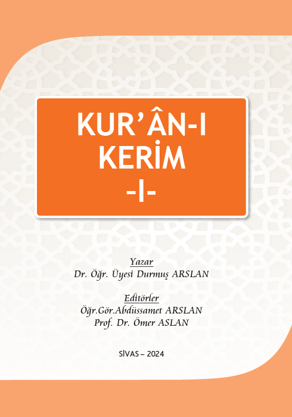
“Kur’ An-I Kerim I” 2. Baskı
Yayınevi:
Cumhuriyet Üniversitesi Yayınları
Kur’ân tarihine bakıldığında tenzîl döneminde onun, bir taraftan ezberlenme ve yazı yoluyla kayıt altına alınıp tilavet edildiği, diğer taraftan da insanlar tarafından hayata tatbik edildiği müşahede edilmektedir. Bu durum, onun yazılması ve kayıt altına alınmasındaki asıl espriyi gösterdiği gibi, İlâhî kelamın daha sonraki nesillere aktarılması ve açıklanması gerektiğini de ortaya koymaktadır. Nitekim bu silsile hep böyle devam etmiş ve her devrin İslam bilginleri, Kur’ân’ı aslına uygun bir şekilde okuyabilmenin ve onu daha iyi anlayabilmenin gayreti içerisinde olmuşlardır.
Kur’ân’ın hem lafız hem de mana yönünden tamamen kendisine özgü bir üslup ve yapısı vardır. Tüm insanlık için bir hidayet kaynağı olduğunu beyan eden Kur’ân’ın (Bakara, 2:185.) hem daha güzel hem de özüne daha uygun bir şekilde anlaşılıp yorumlanması yönünde Ulûmu’l-Kur’ân bağlamında birbirinden çok farklı ve kıymetli eserler meydana getirilmiştir. Bu çerçevede Kur’ân’ın mana ve mefhumunun esprisine uygun bir şekilde anlaşılması için tefsir usul ve metodolojisi gibi teknik yöntemler geliştirilmiş iken, aslına uygun bir şekilde tilavet edilebilmesi ve okunabilmesi için de kıraat ve tecvîd esasları tedvîn edilmiştir. Bu esaslar, bizzat Hz. Peygamber ve ashabının tilavet keyfiyetine göre şekillenerek kayda geçirilmiştir.
Bu çalışma Cumhuriyet Üniversitesi Uzaktan Eğitim Merkezi’nin İlahiyat Lisans Tamamlama (İLİTAM) Programı çerçevesinde işlenen Kur’ân-ı Kerim dersleri kapsamında oluşturulduğundan, ondört ders haftası için ondört ünite şeklinde hazırlanmıştır. Bu ders kitabı, İLİTAM programında yer alan Kur’ân-ı Kerim – I, II, III, IV serisi ile takip edilen ve üçüncü sırada yer alan Kur’ân-ı Kerim – III dersinde işlenmesi gereken müfredata göre hazırlanmıştır. Dolayısıyla Kur’ân tilavetiyle ilgili aranan tüm konular sadece burada değil, diğer kitaplarla (I, II ve IV) birlikte mülahaza edilmelidir.
×
Durmuş ARSLAN, Mustafa Yücel ŞARALDI, Ömer ASLAN
/* Action Buttons */
.action-buttons {
display: flex;
flex-direction: column;
gap: 1rem;
}
.modern-action-btn {
background: linear-gradient(135deg, #dc3545 0%, #c82333 100%);
color: white;
padding: 1rem 2rem;
border-radius: 12px;
text-decoration: none;
font-weight: 600;
font-size: 1rem;
text-align: center;
border: none;
transition: all 0.3s cubic-bezier(0.4, 0, 0.2, 1);
box-shadow: 0 4px 16px rgba(220, 53, 69, 0.2);
display: flex;
align-items: center;
justify-content: center;
gap: 0.75rem;
}
.modern-action-btn.secondary-btn {
background: linear-gradient(135deg, #6c757d 0%, #5a6268 100%);
box-shadow: 0 4px 16px rgba(108, 117, 125, 0.2);
}
.modern-action-btn:hover {
transform: translateY(-2px);
box-shadow: 0 8px 24px rgba(220, 53, 69, 0.3);
color: white;
text-decoration: none;
}
.modern-action-btn.secondary-btn:hover {
box-shadow: 0 8px 24px rgba(108, 117, 125, 0.3);
}
.auth-buttons {
display: grid;
grid-template-columns: 1fr 1fr;
gap: 1rem;
}
.auth-notice .notice-card {
background: linear-gradient(135deg, #17a2b8 0%, #138496 100%);
color: white;
padding: 1rem 1.5rem;
border-radius: 12px;
display: flex;
align-items: center;
gap: 0.75rem;
font-weight: 500;
box-shadow: 0 4px 16px rgba(23, 162, 184, 0.2);
}
.notice-icon {
font-size: 1.25rem;
flex-shrink: 0;
}
/* Info Cards */
.info-card {
background: white;
border-radius: 16px;
box-shadow: 0 4px 16px rgba(0, 0, 0, 0.08);
border: 1px solid #e9ecef;
overflow: hidden;
transition: all 0.3s ease;
}
.info-card:hover {
transform: translateY(-2px);
box-shadow: 0 8px 24px rgba(0, 0, 0, 0.12);
}
.info-card .card-header {
background: linear-gradient(135deg, #dc3545 0%, #c82333 100%);
color: white;
padding: 1.25rem 1.5rem;
border-bottom: none;
}
/* Combined Content Styling */
.combined-content {
display: flex;
gap: 2rem;
align-items: flex-start;
}
.info-section {
flex: 0 0 40%;
min-width: 300px;
}
.description-section {
flex: 1;
background: #f8f9fa;
border-radius: 12px;
padding: 1.5rem;
border: 1px solid #e9ecef;
}
.description-title {
color: #2c3e50;
font-weight: 600;
font-size: 1rem;
margin-bottom: 1rem;
display: flex;
align-items: center;
}
.info-grid-compact {
display: grid;
grid-template-columns: 1fr;
gap: 1rem;
}
.card-title {
margin: 0;
font-weight: 600;
font-size: 1.1rem;
display: flex;
align-items: center;
gap: 0.75rem;
}
.card-icon {
font-size: 1.25rem;
opacity: 0.9;
}
.card-content {
padding: 1.5rem;
}
.info-grid {
display: grid;
grid-template-columns: repeat(auto-fit, minmax(250px, 1fr));
gap: 1.5rem;
}
.info-item {
display: flex;
flex-direction: column;
gap: 0.5rem;
}
.info-label {
font-weight: 600;
color: #2c3e50;
font-size: 0.9rem;
text-transform: uppercase;
letter-spacing: 0.5px;
}
.info-value {
color: #6c757d;
font-size: 1rem;
}
.type-badge {
padding: 0.375rem 0.75rem;
border-radius: 20px;
font-weight: 600;
font-size: 0.8rem;
text-transform: uppercase;
letter-spacing: 0.5px;
}
.type-dijital {
background: linear-gradient(135deg, #17a2b8 0%, #138496 100%);
color: white;
}
.type-ikisi {
background: linear-gradient(135deg, #28a745 0%, #20c997 100%);
color: white;
}
.type-fiziksel {
background: linear-gradient(135deg, #6c757d 0%, #5a6268 100%);
color: white;
}
/* Description */
.description-text {
font-size: 1rem;
line-height: 1.8;
color: #495057;
text-align: justify;
}
/* Social Share */
.social-share {
text-align: center;
background: #f8f9fa;
border-radius: 16px;
padding: 1.5rem;
border: 1px solid #e9ecef;
}
.share-title {
color: #2c3e50;
font-weight: 600;
margin-bottom: 1.5rem;
font-size: 1.1rem;
}
.share-buttons {
display: flex;
justify-content: center;
gap: 0.75rem;
flex-wrap: wrap;
}
.share-btn {
padding: 0.75rem 1rem;
border-radius: 50px;
text-decoration: none;
font-weight: 600;
font-size: 0.9rem;
transition: all 0.3s cubic-bezier(0.4, 0, 0.2, 1);
display: flex;
align-items: center;
gap: 0.5rem;
border: 2px solid transparent;
position: relative;
overflow: hidden;
}
.share-btn.facebook {
background: linear-gradient(135deg, #3b5998 0%, #2d4373 100%);
color: white;
}
.share-btn.twitter {
background: linear-gradient(135deg, #1da1f2 0%, #0d8bd9 100%);
color: white;
}
.share-btn.whatsapp {
background: linear-gradient(135deg, #25d366 0%, #20ba5a 100%);
color: white;
}
.share-btn.email {
background: linear-gradient(135deg, #6c757d 0%, #5a6268 100%);
color: white;
}
.share-btn:hover {
transform: translateY(-3px);
box-shadow: 0 6px 20px rgba(0, 0, 0, 0.15);
color: white;
text-decoration: none;
}
/* Related Products Section */
.related-products, .author-products {
background: linear-gradient(135deg, #f8f9fa 0%, #e9ecef 100%);
}
.section-header {
text-align: center;
}
.section-main-title {
color: #2c3e50;
font-weight: 700;
font-size: 2rem;
margin-bottom: 0.5rem;
display: flex;
align-items: center;
justify-content: center;
gap: 1rem;
}
.section-main-title .section-icon {
color: #dc3545;
font-size: 1.75rem;
}
/* Products Grid for Related */
.products-grid {
display: grid;
grid-template-columns: repeat(auto-fill, minmax(280px, 1fr));
gap: 2rem;
padding: 0;
}
.products-grid .product-card {
background: white;
border-radius: 16px;
overflow: hidden;
box-shadow: 0 4px 16px rgba(0, 0, 0, 0.08);
border: 1px solid #e9ecef;
transition: all 0.4s cubic-bezier(0.4, 0, 0.2, 1);
}
.products-grid .product-card:hover {
transform: translateY(-6px) scale(1.02);
box-shadow: 0 12px 32px rgba(0, 0, 0, 0.15);
}
.products-grid .product-image {
height: 260px;
overflow: hidden;
background: #f8f9fa;
position: relative;
}
.products-grid .product-image-actions {
position: absolute;
top: 12px;
right: 12px;
z-index: 5;
opacity: 1;
}
.products-grid .btn-view-detail {
display: inline-flex;
align-items: center;
justify-content: center;
width: 40px;
height: 40px;
background: rgba(0, 0, 0, 0.6);
border: none;
border-radius: 50%;
font-size: 1rem;
color: white;
text-decoration: none;
transition: all 0.3s ease;
}
.products-grid .btn-view-detail:hover {
transform: scale(1.1);
background: rgba(220, 53, 69, 0.9);
color: white;
}
.products-grid .product-image img {
width: 100%;
height: 100%;
object-fit: contain;
padding: 1rem;
transition: transform 0.3s ease;
}
.products-grid .product-info {
padding: 1.25rem;
}
.products-grid .product-title {
margin-bottom: 0.75rem;
}
.products-grid .product-title a {
color: #2c3e50;
text-decoration: none;
font-weight: 600;
font-size: 1rem;
line-height: 1.4;
transition: color 0.3s ease;
}
.products-grid .product-title a:hover {
color: #dc3545;
text-decoration: none;
}
.products-grid .product-author {
color: #6c757d;
font-size: 0.9rem;
margin-bottom: 1rem;
font-style: italic;
}
.products-grid .stock-status {
background: #d4841a;
color: white;
border-radius: 8px;
padding: 0.75rem 1rem;
display: flex;
align-items: center;
justify-content: space-between;
margin-top: auto;
}
.products-grid .stock-status.out-of-stock {
background: #6c757d;
}
.products-grid .stock-text {
font-weight: 700;
font-size: 0.8rem;
letter-spacing: 0.5px;
}
.products-grid .stock-status .price-info {
display: flex;
align-items: center;
gap: 0.5rem;
white-space: nowrap;
}
.products-grid .current-price {
font-weight: 700;
font-size: 1.1rem;
color: #ffffff;
}
.products-grid .btn-add-cart-inline {
background: #dc3545;
color: #ffffff;
border: none;
width: 42px;
height: 42px;
border-radius: 50%;
display: flex;
align-items: center;
justify-content: center;
font-size: 1.1rem;
transition: all 0.3s ease;
margin-left: 0.5rem;
}
.products-grid .btn-add-cart-inline:hover {
background: #b02a37;
color: #ffffff;
transform: scale(1.1);
}
.products-grid .empty-state-card {
background: white;
border-radius: 16px;
border: 1px solid #e9ecef;
padding: 2rem;
text-align: center;
color: #6c757d;
grid-column: 1 / -1;
}
.products-grid .empty-state-content {
display: flex;
flex-direction: column;
align-items: center;
gap: 0.75rem;
font-weight: 600;
}
.products-grid .empty-state-content i {
font-size: 2rem;
color: #dc3545;
}
/* Responsive Design */
@media (max-width: 768px) {
.product-detail-title {
font-size: 1.5rem;
}
.product-detail-subtitle {
font-size: 1rem;
}
.auth-buttons {
grid-template-columns: 1fr;
}
.info-grid {
grid-template-columns: 1fr;
}
.combined-content {
flex-direction: column;
gap: 1.5rem;
}
.info-section {
flex: none;
min-width: auto;
}
.share-buttons {
flex-direction: column;
align-items: center;
}
.share-btn {
width: 100%;
max-width: 200px;
justify-content: center;
}
.author-card {
flex-direction: column;
text-align: center;
}
.section-main-title {
font-size: 1.5rem;
}
.products-grid {
grid-template-columns: repeat(auto-fill, minmax(250px, 1fr));
gap: 1.5rem;
}
}
@media (max-width: 576px) {
.modern-stock-status {
flex-direction: column;
gap: 1rem;
text-align: center;
}
.current-price {
font-size: 1.75rem;
}
.products-grid {
grid-template-columns: 1fr;
gap: 1.5rem;
}
}
/* Loading and Animation States */
.product-card {
animation: fadeInUp 0.6s ease-out;
}
@keyframes fadeInUp {
from {
opacity: 0;
transform: translateY(30px);
}
to {
opacity: 1;
transform: translateY(0);
}
}
/* Legacy compatibility */
.hover-shadow {
transition: all 0.3s ease;
}
.hover-shadow:hover {
transform: translateY(-5px);
box-shadow: 0 10px 30px rgba(0,0,0,0.15) !important;
}
.main-image-container {
background: #f8f9fa;
padding: 20px;
border-radius: 10px;
}
.badge-lg {
padding: 8px 15px;
font-size: 14px;
}