Sosyal Bi̇li̇mler
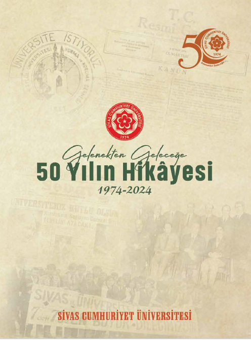
Gelenekten Geleceğe 50Yılın Hikayesi Sivas Cumhuriyet Üniversitesi (1974-2024)
Yazar
Hakan YEKBAŞ- Ahmet YÜKSEL
Yayınevi:
Cumhuriyet Üniversitesi Yayınları
Türkiye Cumhuriyeti’nin 50. Yılı anısına kurulmuş olmanın gururuna sahip olan ve Cumhuriyet’in 100. Yılını idrak ederken yarım asrı geride bırakmış Cumhuriyet Üniversitesinin gerek mücadelelerle dolu kuruluş hikâyesinin gerekse büyük gayretler ve özverilerle bu güne geliş sürecinin artık emektarların hafızalarından tarih sayfalarına taşınması gerektiği inancıyla bu kitabı hazırlama kararı verildi. Üniversitenin kuruluş yıllarına şahit olan onlarca akademik ve idari personelin anılarına başvuruldu, kayıtlar tutuldu. Üniversite arşivlerinde bulunan sayısız belge büyük titizlikle gözden geçirildi. Yerel ve ulusal basında ilgili haberler tarandı. Uzun süren araştırmaların, tasniflerin ve kontrollerin ardından üniversitemizin mensubu 11 akademisyen tarafından yazılan bölümler bir araya getirildi, görsellerle buluşturuldu ve tekrar tekrar gözden geçirildi. Eserin sadece bir kitap değil aynı zamanda bir hak ve emek teslimi, yıllar boyu gelip geçen emektarlara bir teşekkür ve ayrıca üniversitenin sonraki nesillerine hem bir ders hem bir anı olacağı bilinciyle duyulan heyecan sayfalara yansıtılmaya çalışıldı.
Gelenekten Geleceğe 50 Yılın Hikâyesi içinde 1973 senesi 29 Ekim’inde Hacettepe yerleşkesinde Tıp Fakültesine kayıt yaptıran 12 öğrenciyle eğitime başlayan Cumhuriyet Üniversitesinin bugün gelinen noktada 18 fakülte, 4 enstitü, 4 yüksekokul, 14 meslek yüksekokulu ve 1 devlet konservatuvarında hayata hazırlanan 50 bini aşkın öğrencisiyle ile gelişen sürecine ulusal ve uluslararası akademik alanlarda kazandığı başarılara ve bu tarihi sürecin ruhuna tanıklık edeceksiniz.
Bu hikâyede akademik ve idari birimlerin yanı sıra, kuruluştan günümüze Sivas Cumhuriyet Üniversitesi yerleşkesinin çehresinden, yerleşkenin öğrencilerle hayat bulan atmosferine, bilimsel faaliyetlerin ve başarıların yanında öğrenci odaklı sosyal etkinliklerden, spor ve sanat faaliyetlerine yerleşke içerisinde süren yaşama dair pek çok bilgiye ve anıya ulaşacaksınız.
Yolu Cumhuriyet Üniversitesinden geçmiş herkesin kendinden bir parça bulacağı bu eser üniversitenin ilk 50 yılına adanmış olmakla beraber gelecek nice yıllara da bir armağan niteliğindedir. Her kitaplıkta yerini bulması dileğiyle…
×
Bu yazarın başka yayını bulunamadı.
/* Action Buttons */
.action-buttons {
display: flex;
flex-direction: column;
gap: 1rem;
}
.modern-action-btn {
background: linear-gradient(135deg, #dc3545 0%, #c82333 100%);
color: white;
padding: 1rem 2rem;
border-radius: 12px;
text-decoration: none;
font-weight: 600;
font-size: 1rem;
text-align: center;
border: none;
transition: all 0.3s cubic-bezier(0.4, 0, 0.2, 1);
box-shadow: 0 4px 16px rgba(220, 53, 69, 0.2);
display: flex;
align-items: center;
justify-content: center;
gap: 0.75rem;
}
.modern-action-btn.secondary-btn {
background: linear-gradient(135deg, #6c757d 0%, #5a6268 100%);
box-shadow: 0 4px 16px rgba(108, 117, 125, 0.2);
}
.modern-action-btn:hover {
transform: translateY(-2px);
box-shadow: 0 8px 24px rgba(220, 53, 69, 0.3);
color: white;
text-decoration: none;
}
.modern-action-btn.secondary-btn:hover {
box-shadow: 0 8px 24px rgba(108, 117, 125, 0.3);
}
.auth-buttons {
display: grid;
grid-template-columns: 1fr 1fr;
gap: 1rem;
}
.auth-notice .notice-card {
background: linear-gradient(135deg, #17a2b8 0%, #138496 100%);
color: white;
padding: 1rem 1.5rem;
border-radius: 12px;
display: flex;
align-items: center;
gap: 0.75rem;
font-weight: 500;
box-shadow: 0 4px 16px rgba(23, 162, 184, 0.2);
}
.notice-icon {
font-size: 1.25rem;
flex-shrink: 0;
}
/* Info Cards */
.info-card {
background: white;
border-radius: 16px;
box-shadow: 0 4px 16px rgba(0, 0, 0, 0.08);
border: 1px solid #e9ecef;
overflow: hidden;
transition: all 0.3s ease;
}
.info-card:hover {
transform: translateY(-2px);
box-shadow: 0 8px 24px rgba(0, 0, 0, 0.12);
}
.info-card .card-header {
background: linear-gradient(135deg, #dc3545 0%, #c82333 100%);
color: white;
padding: 1.25rem 1.5rem;
border-bottom: none;
}
/* Combined Content Styling */
.combined-content {
display: flex;
gap: 2rem;
align-items: flex-start;
}
.info-section {
flex: 0 0 40%;
min-width: 300px;
}
.description-section {
flex: 1;
background: #f8f9fa;
border-radius: 12px;
padding: 1.5rem;
border: 1px solid #e9ecef;
}
.description-title {
color: #2c3e50;
font-weight: 600;
font-size: 1rem;
margin-bottom: 1rem;
display: flex;
align-items: center;
}
.info-grid-compact {
display: grid;
grid-template-columns: 1fr;
gap: 1rem;
}
.card-title {
margin: 0;
font-weight: 600;
font-size: 1.1rem;
display: flex;
align-items: center;
gap: 0.75rem;
}
.card-icon {
font-size: 1.25rem;
opacity: 0.9;
}
.card-content {
padding: 1.5rem;
}
.info-grid {
display: grid;
grid-template-columns: repeat(auto-fit, minmax(250px, 1fr));
gap: 1.5rem;
}
.info-item {
display: flex;
flex-direction: column;
gap: 0.5rem;
}
.info-label {
font-weight: 600;
color: #2c3e50;
font-size: 0.9rem;
text-transform: uppercase;
letter-spacing: 0.5px;
}
.info-value {
color: #6c757d;
font-size: 1rem;
}
.type-badge {
padding: 0.375rem 0.75rem;
border-radius: 20px;
font-weight: 600;
font-size: 0.8rem;
text-transform: uppercase;
letter-spacing: 0.5px;
}
.type-dijital {
background: linear-gradient(135deg, #17a2b8 0%, #138496 100%);
color: white;
}
.type-ikisi {
background: linear-gradient(135deg, #28a745 0%, #20c997 100%);
color: white;
}
.type-fiziksel {
background: linear-gradient(135deg, #6c757d 0%, #5a6268 100%);
color: white;
}
/* Description */
.description-text {
font-size: 1rem;
line-height: 1.8;
color: #495057;
text-align: justify;
}
/* Social Share */
.social-share {
text-align: center;
background: #f8f9fa;
border-radius: 16px;
padding: 1.5rem;
border: 1px solid #e9ecef;
}
.share-title {
color: #2c3e50;
font-weight: 600;
margin-bottom: 1.5rem;
font-size: 1.1rem;
}
.share-buttons {
display: flex;
justify-content: center;
gap: 0.75rem;
flex-wrap: wrap;
}
.share-btn {
padding: 0.75rem 1rem;
border-radius: 50px;
text-decoration: none;
font-weight: 600;
font-size: 0.9rem;
transition: all 0.3s cubic-bezier(0.4, 0, 0.2, 1);
display: flex;
align-items: center;
gap: 0.5rem;
border: 2px solid transparent;
position: relative;
overflow: hidden;
}
.share-btn.facebook {
background: linear-gradient(135deg, #3b5998 0%, #2d4373 100%);
color: white;
}
.share-btn.twitter {
background: linear-gradient(135deg, #1da1f2 0%, #0d8bd9 100%);
color: white;
}
.share-btn.whatsapp {
background: linear-gradient(135deg, #25d366 0%, #20ba5a 100%);
color: white;
}
.share-btn.email {
background: linear-gradient(135deg, #6c757d 0%, #5a6268 100%);
color: white;
}
.share-btn:hover {
transform: translateY(-3px);
box-shadow: 0 6px 20px rgba(0, 0, 0, 0.15);
color: white;
text-decoration: none;
}
/* Related Products Section */
.related-products, .author-products {
background: linear-gradient(135deg, #f8f9fa 0%, #e9ecef 100%);
}
.section-header {
text-align: center;
}
.section-main-title {
color: #2c3e50;
font-weight: 700;
font-size: 2rem;
margin-bottom: 0.5rem;
display: flex;
align-items: center;
justify-content: center;
gap: 1rem;
}
.section-main-title .section-icon {
color: #dc3545;
font-size: 1.75rem;
}
/* Products Grid for Related */
.products-grid {
display: grid;
grid-template-columns: repeat(auto-fill, minmax(280px, 1fr));
gap: 2rem;
padding: 0;
}
.products-grid .product-card {
background: white;
border-radius: 16px;
overflow: hidden;
box-shadow: 0 4px 16px rgba(0, 0, 0, 0.08);
border: 1px solid #e9ecef;
transition: all 0.4s cubic-bezier(0.4, 0, 0.2, 1);
}
.products-grid .product-card:hover {
transform: translateY(-6px) scale(1.02);
box-shadow: 0 12px 32px rgba(0, 0, 0, 0.15);
}
.products-grid .product-image {
height: 260px;
overflow: hidden;
background: #f8f9fa;
position: relative;
}
.products-grid .product-image-actions {
position: absolute;
top: 12px;
right: 12px;
z-index: 5;
opacity: 1;
}
.products-grid .btn-view-detail {
display: inline-flex;
align-items: center;
justify-content: center;
width: 40px;
height: 40px;
background: rgba(0, 0, 0, 0.6);
border: none;
border-radius: 50%;
font-size: 1rem;
color: white;
text-decoration: none;
transition: all 0.3s ease;
}
.products-grid .btn-view-detail:hover {
transform: scale(1.1);
background: rgba(220, 53, 69, 0.9);
color: white;
}
.products-grid .product-image img {
width: 100%;
height: 100%;
object-fit: contain;
padding: 1rem;
transition: transform 0.3s ease;
}
.products-grid .product-info {
padding: 1.25rem;
}
.products-grid .product-title {
margin-bottom: 0.75rem;
}
.products-grid .product-title a {
color: #2c3e50;
text-decoration: none;
font-weight: 600;
font-size: 1rem;
line-height: 1.4;
transition: color 0.3s ease;
}
.products-grid .product-title a:hover {
color: #dc3545;
text-decoration: none;
}
.products-grid .product-author {
color: #6c757d;
font-size: 0.9rem;
margin-bottom: 1rem;
font-style: italic;
}
.products-grid .stock-status {
background: #d4841a;
color: white;
border-radius: 8px;
padding: 0.75rem 1rem;
display: flex;
align-items: center;
justify-content: space-between;
margin-top: auto;
}
.products-grid .stock-status.out-of-stock {
background: #6c757d;
}
.products-grid .stock-text {
font-weight: 700;
font-size: 0.8rem;
letter-spacing: 0.5px;
}
.products-grid .stock-status .price-info {
display: flex;
align-items: center;
gap: 0.5rem;
white-space: nowrap;
}
.products-grid .current-price {
font-weight: 700;
font-size: 1.1rem;
color: #ffffff;
}
.products-grid .btn-add-cart-inline {
background: #dc3545;
color: #ffffff;
border: none;
width: 42px;
height: 42px;
border-radius: 50%;
display: flex;
align-items: center;
justify-content: center;
font-size: 1.1rem;
transition: all 0.3s ease;
margin-left: 0.5rem;
}
.products-grid .btn-add-cart-inline:hover {
background: #b02a37;
color: #ffffff;
transform: scale(1.1);
}
.products-grid .empty-state-card {
background: white;
border-radius: 16px;
border: 1px solid #e9ecef;
padding: 2rem;
text-align: center;
color: #6c757d;
grid-column: 1 / -1;
}
.products-grid .empty-state-content {
display: flex;
flex-direction: column;
align-items: center;
gap: 0.75rem;
font-weight: 600;
}
.products-grid .empty-state-content i {
font-size: 2rem;
color: #dc3545;
}
/* Responsive Design */
@media (max-width: 768px) {
.product-detail-title {
font-size: 1.5rem;
}
.product-detail-subtitle {
font-size: 1rem;
}
.auth-buttons {
grid-template-columns: 1fr;
}
.info-grid {
grid-template-columns: 1fr;
}
.combined-content {
flex-direction: column;
gap: 1.5rem;
}
.info-section {
flex: none;
min-width: auto;
}
.share-buttons {
flex-direction: column;
align-items: center;
}
.share-btn {
width: 100%;
max-width: 200px;
justify-content: center;
}
.author-card {
flex-direction: column;
text-align: center;
}
.section-main-title {
font-size: 1.5rem;
}
.products-grid {
grid-template-columns: repeat(auto-fill, minmax(250px, 1fr));
gap: 1.5rem;
}
}
@media (max-width: 576px) {
.modern-stock-status {
flex-direction: column;
gap: 1rem;
text-align: center;
}
.current-price {
font-size: 1.75rem;
}
.products-grid {
grid-template-columns: 1fr;
gap: 1.5rem;
}
}
/* Loading and Animation States */
.product-card {
animation: fadeInUp 0.6s ease-out;
}
@keyframes fadeInUp {
from {
opacity: 0;
transform: translateY(30px);
}
to {
opacity: 1;
transform: translateY(0);
}
}
/* Legacy compatibility */
.hover-shadow {
transition: all 0.3s ease;
}
.hover-shadow:hover {
transform: translateY(-5px);
box-shadow: 0 10px 30px rgba(0,0,0,0.15) !important;
}
.main-image-container {
background: #f8f9fa;
padding: 20px;
border-radius: 10px;
}
.badge-lg {
padding: 8px 15px;
font-size: 14px;
}