Elektronik Yayın
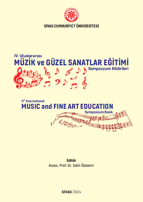
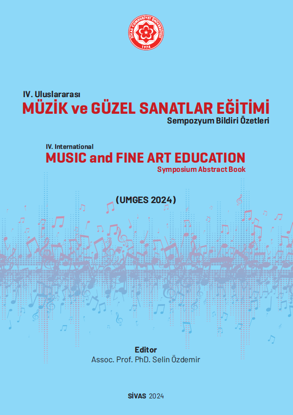
Iv. Uluslararası Müzik Ve Güzel Sanatlar Eğitimi Sempozyumu Tam Metin Kitapçığı (umges)
Yazarlar

STOKTA
100 adet
50.00 ₺
Yayın Bilgileri
Yayın Yılı:
2024
ISBN:
978-625-6497-54-2
Yayın Tipi:
Dijital
Dil:
İngilizce
Yayınevi:
Cumhuriyet Üniversitesi Yayınları
Baskı Bilgisi:
1. Baskı
Sayfa Sayısı:
64 sayfa
Yayın Hakkında
Dear Readers : Sivas Cumhuriyet University Faculty of Education Fine Arts Education Department participated in the ‘International Symposium on Music and Fine Arts Education’ this year with 16 papers by 20 music researchers from eight different countries. All abstracts were published in the abstract booklet and all full texts were published in this book. I would like to express my endless thanks to all participants whose full texts and abstracts were published. Topics such as music psychology, music philosophy, classical Western music, classical Türk music, prosody, violin teaching methods, artificial intelligence, music education in Finland, Ageism and consideration for music education, music teachers as classroom leaders, contemporary Türk composers, popular music, stage fright, The Concept of Kitsch, wisdom pedagogy and composition were evaluated and discussed. Symposium is one of the most important events of scientific meetings where knowledge increases as it is shared. It is obvious that the dialogue and information sharing with music researchers from the USA, Canada, Australia, England, Finland, Spain, China and Turkiye, who have valuable equipment from each other, enriches both the guests and us, the hosts. In addition, the participation of the graduate students of our department was a separate happiness for me. I would like to thank the Rector and the honorary chairman of the symposium Prf. Dr. Ahmet Şengönül, the dean of the faculty of education, the head of fine arts department, the head of music major, participants, students and everyone who contributed. Hoping to see you in many more symposiums, I would like to thank all those who have contributed and present my sincere love and respect.
Aynı Kategoriden Diğer Yayınlar
STOKTA YOK
50.00 ₺
STOKTA YOK
50.00 ₺
STOKTA YOK
50.00 ₺
Yazarın Diğer Yayınları
STOKTA YOK
50.00 ₺
STOKTA YOK
110.00 ₺
STOKTA YOK
110.00 ₺