Sosyal Bi̇li̇mler
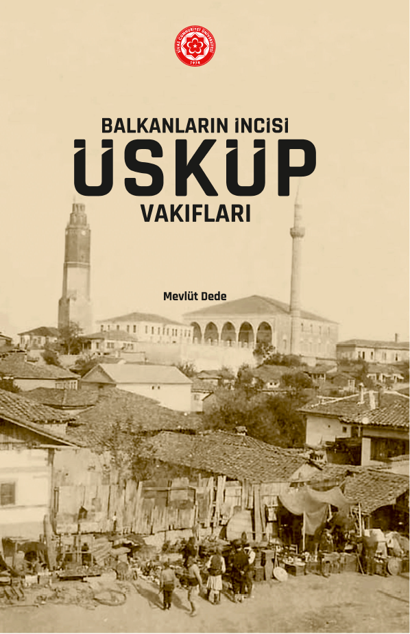
Balkanların İncisi Üsküp Vakıfları
Yazar

STOKTA
48 adet
175.00 ₺
Yayın Bilgileri
Yayın Yılı:
2025
ISBN:
978-625-6497-61-0
Yayın Tipi:
Basılı
Dil:
Türkçe
Yayınevi:
Cumhuriyet Üniversitesi Yayınları
Baskı Bilgisi:
1. Baskı
Sayfa Sayısı:
202 sayfa
Yayın Hakkında
Bu kitap 2015 yılında Gazi Üniversitesi’nde tamamlanmış olan Üsküp Vakıfları -Bir Sosyal Tarih İncelemesi- adlı doktora tezine dayanmaktadır. Üsküp 1392 yılında Osmanlı Devleti hâkimiyeti altına girmiştir. Beş asrı aşkın bir süre Osmanlı Devleti hâkimiyetinde kalan şehir, Balkan Savaşları’nın ardından 10 Ağustos 1913’te imzalanan Bükreş Anlaşması’yla Osmanlı topraklarından ayrılmıştır. Osmanlı Devleti’nin Üsküp’te kalıcı olmasında en önemli kurumlardan birisi vakıf olmuştur. Üsküp’teki Osmanlı hâkimiyetinin ilk döneminden, son yıllarına kadar şehirde vakıflar kurulmuştur. Bu vakıflar kimi zaman bir Osmanlı Padişahı tarafından, kimi zaman askerî sınıfa mensup kişiler tarafından kurulmuştur. Şehirde ve şehre bağlı kırsal alanda başta ibadet amaçlı cami ve mescitler olmak üzere, han, hamam, mektep, medrese, tekke, zaviye vb. birçok farklı yapılar inşa edilmiştir. Bu çalışmada Osmanlı döneminde Üsküp’te kurulan vakıflar incelenmiştir. Vakıflar bünyesinde, Üsküp’te, toplumun başta dini olmak üzere, iktisadi ve içtimai birçok ihtiyaçları karşılanmıştır. Vakıflar, şehre çok önemli kalıcı etkilerde bulunmuştur. Bunların en bariz örnekleri ise- Üsküp’teki en eski vakıf eseri olan Sultan II. Murad Camii olmak üzere- hala ayakta kalan vakıf eserleridir. Mimari açıdan önemli yere sahip olan bu eserler Üsküp şehrinin Osmanlı’dan günümüze intikal eden en önemli tarihi mirasıdır.
Aynı Kategoriden Diğer Yayınlar
STOKTA YOK
100.00 ₺
STOKTA YOK
600.00 ₺
STOKTA YOK
200.00 ₺