Elektronik Yayın
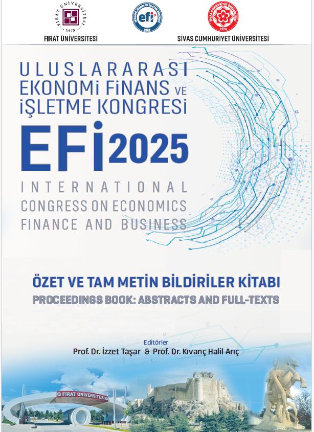
Efi̇ 2025 Kongresi Özet Ve Tam Metin Bildiriler Kitabı / Uluslararası Ekonomi Finans Ve İşletme Kongresi
Yayınevi:
Cumhuriyet Üniversitesi Yayınları
Dünyada bilgi toplumuna geçiş süreci, bilginin üretilmesi, paylaşılması ve etkin biçimde kullanılması gerekliliğini her zamankinden daha önemli hale getirmiştir. Bu bağlamda, akademik kongreler bilimsel iletişimin en temel platformlarından biri olarak öne çıkmaktadır. Kongreler, akademisyenlerin ve araştırmacıların bir araya gelerek bilgi alışverişinde bulunmalarına, güncel gelişmeleri tartışmalarına ve yeni iş birlikleri kurmalarına imkân sağlamaktadır.
Bu kapsamda düzenlenen EFİ-2025 Kongresi, ekonomi, finans ve işletme alanlarında çalışan akademisyenleri ve lisansüstü öğrencileri bir araya getirerek, ilgili alanlardaki bilimsel ilerlemeleri paylaşmayı, geleceğe dönük araştırma ağlarını güçlendirmeyi ve akademik etkileşimi artırmayı hedeflemiştir. Bu yıl üçüncüsü düzenlenen kongre, Fırat Üniversitesi’nin 50. yılı vesilesiyle, Fırat Üniversitesi ev sahipliğinde ve Sivas Cumhuriyet Üniversitesi iş birliğiyle 15–17 Mayıs 2025 tarihlerinde Elazığ’da gerçekleştirilmiştir.
Kongreye Türkiye’nin çeşitli üniversitelerinden akademisyenler ve lisansüstü öğrenciler katılım sağlamış, 62’si yüz yüze, 49’u çevrimiçi olmak üzere toplam 111 bildiri sunulmuştur. EFİ-2025 Kongresi’nin başarıyla gerçekleştirilmesinde katkı sunan Fırat Üniversitesi Rektörü Prof. Dr. Fahrettin Göktaş, Sivas Cumhuriyet Üniversitesi Rektörü Prof. Dr. Ahmet Şengönül, tüm düzenleme kurulu üyeleri ile destekleri için Elazığ Valiliği, Elazığ Belediyesi, Elazığ Barosu ve Ekol Lojistik’e teşekkür ederiz.
×
/* Action Buttons */
.action-buttons {
display: flex;
flex-direction: column;
gap: 1rem;
}
.modern-action-btn {
background: linear-gradient(135deg, #dc3545 0%, #c82333 100%);
color: white;
padding: 1rem 2rem;
border-radius: 12px;
text-decoration: none;
font-weight: 600;
font-size: 1rem;
text-align: center;
border: none;
transition: all 0.3s cubic-bezier(0.4, 0, 0.2, 1);
box-shadow: 0 4px 16px rgba(220, 53, 69, 0.2);
display: flex;
align-items: center;
justify-content: center;
gap: 0.75rem;
}
.modern-action-btn.secondary-btn {
background: linear-gradient(135deg, #6c757d 0%, #5a6268 100%);
box-shadow: 0 4px 16px rgba(108, 117, 125, 0.2);
}
.modern-action-btn:hover {
transform: translateY(-2px);
box-shadow: 0 8px 24px rgba(220, 53, 69, 0.3);
color: white;
text-decoration: none;
}
.modern-action-btn.secondary-btn:hover {
box-shadow: 0 8px 24px rgba(108, 117, 125, 0.3);
}
.auth-buttons {
display: grid;
grid-template-columns: 1fr 1fr;
gap: 1rem;
}
.auth-notice .notice-card {
background: linear-gradient(135deg, #17a2b8 0%, #138496 100%);
color: white;
padding: 1rem 1.5rem;
border-radius: 12px;
display: flex;
align-items: center;
gap: 0.75rem;
font-weight: 500;
box-shadow: 0 4px 16px rgba(23, 162, 184, 0.2);
}
.notice-icon {
font-size: 1.25rem;
flex-shrink: 0;
}
/* Info Cards */
.info-card {
background: white;
border-radius: 16px;
box-shadow: 0 4px 16px rgba(0, 0, 0, 0.08);
border: 1px solid #e9ecef;
overflow: hidden;
transition: all 0.3s ease;
}
.info-card:hover {
transform: translateY(-2px);
box-shadow: 0 8px 24px rgba(0, 0, 0, 0.12);
}
.info-card .card-header {
background: linear-gradient(135deg, #dc3545 0%, #c82333 100%);
color: white;
padding: 1.25rem 1.5rem;
border-bottom: none;
}
/* Combined Content Styling */
.combined-content {
display: flex;
gap: 2rem;
align-items: flex-start;
}
.info-section {
flex: 0 0 40%;
min-width: 300px;
}
.description-section {
flex: 1;
background: #f8f9fa;
border-radius: 12px;
padding: 1.5rem;
border: 1px solid #e9ecef;
}
.description-title {
color: #2c3e50;
font-weight: 600;
font-size: 1rem;
margin-bottom: 1rem;
display: flex;
align-items: center;
}
.info-grid-compact {
display: grid;
grid-template-columns: 1fr;
gap: 1rem;
}
.card-title {
margin: 0;
font-weight: 600;
font-size: 1.1rem;
display: flex;
align-items: center;
gap: 0.75rem;
}
.card-icon {
font-size: 1.25rem;
opacity: 0.9;
}
.card-content {
padding: 1.5rem;
}
.info-grid {
display: grid;
grid-template-columns: repeat(auto-fit, minmax(250px, 1fr));
gap: 1.5rem;
}
.info-item {
display: flex;
flex-direction: column;
gap: 0.5rem;
}
.info-label {
font-weight: 600;
color: #2c3e50;
font-size: 0.9rem;
text-transform: uppercase;
letter-spacing: 0.5px;
}
.info-value {
color: #6c757d;
font-size: 1rem;
}
.type-badge {
padding: 0.375rem 0.75rem;
border-radius: 20px;
font-weight: 600;
font-size: 0.8rem;
text-transform: uppercase;
letter-spacing: 0.5px;
}
.type-dijital {
background: linear-gradient(135deg, #17a2b8 0%, #138496 100%);
color: white;
}
.type-ikisi {
background: linear-gradient(135deg, #28a745 0%, #20c997 100%);
color: white;
}
.type-fiziksel {
background: linear-gradient(135deg, #6c757d 0%, #5a6268 100%);
color: white;
}
/* Description */
.description-text {
font-size: 1rem;
line-height: 1.8;
color: #495057;
text-align: justify;
}
/* Social Share */
.social-share {
text-align: center;
background: #f8f9fa;
border-radius: 16px;
padding: 1.5rem;
border: 1px solid #e9ecef;
}
.share-title {
color: #2c3e50;
font-weight: 600;
margin-bottom: 1.5rem;
font-size: 1.1rem;
}
.share-buttons {
display: flex;
justify-content: center;
gap: 0.75rem;
flex-wrap: wrap;
}
.share-btn {
padding: 0.75rem 1rem;
border-radius: 50px;
text-decoration: none;
font-weight: 600;
font-size: 0.9rem;
transition: all 0.3s cubic-bezier(0.4, 0, 0.2, 1);
display: flex;
align-items: center;
gap: 0.5rem;
border: 2px solid transparent;
position: relative;
overflow: hidden;
}
.share-btn.facebook {
background: linear-gradient(135deg, #3b5998 0%, #2d4373 100%);
color: white;
}
.share-btn.twitter {
background: linear-gradient(135deg, #1da1f2 0%, #0d8bd9 100%);
color: white;
}
.share-btn.whatsapp {
background: linear-gradient(135deg, #25d366 0%, #20ba5a 100%);
color: white;
}
.share-btn.email {
background: linear-gradient(135deg, #6c757d 0%, #5a6268 100%);
color: white;
}
.share-btn:hover {
transform: translateY(-3px);
box-shadow: 0 6px 20px rgba(0, 0, 0, 0.15);
color: white;
text-decoration: none;
}
/* Related Products Section */
.related-products, .author-products {
background: linear-gradient(135deg, #f8f9fa 0%, #e9ecef 100%);
}
.section-header {
text-align: center;
}
.section-main-title {
color: #2c3e50;
font-weight: 700;
font-size: 2rem;
margin-bottom: 0.5rem;
display: flex;
align-items: center;
justify-content: center;
gap: 1rem;
}
.section-main-title .section-icon {
color: #dc3545;
font-size: 1.75rem;
}
/* Products Grid for Related */
.products-grid {
display: grid;
grid-template-columns: repeat(auto-fill, minmax(280px, 1fr));
gap: 2rem;
padding: 0;
}
.products-grid .product-card {
background: white;
border-radius: 16px;
overflow: hidden;
box-shadow: 0 4px 16px rgba(0, 0, 0, 0.08);
border: 1px solid #e9ecef;
transition: all 0.4s cubic-bezier(0.4, 0, 0.2, 1);
}
.products-grid .product-card:hover {
transform: translateY(-6px) scale(1.02);
box-shadow: 0 12px 32px rgba(0, 0, 0, 0.15);
}
.products-grid .product-image {
height: 260px;
overflow: hidden;
background: #f8f9fa;
position: relative;
}
.products-grid .product-image-actions {
position: absolute;
top: 12px;
right: 12px;
z-index: 5;
opacity: 1;
}
.products-grid .btn-view-detail {
display: inline-flex;
align-items: center;
justify-content: center;
width: 40px;
height: 40px;
background: rgba(0, 0, 0, 0.6);
border: none;
border-radius: 50%;
font-size: 1rem;
color: white;
text-decoration: none;
transition: all 0.3s ease;
}
.products-grid .btn-view-detail:hover {
transform: scale(1.1);
background: rgba(220, 53, 69, 0.9);
color: white;
}
.products-grid .product-image img {
width: 100%;
height: 100%;
object-fit: contain;
padding: 1rem;
transition: transform 0.3s ease;
}
.products-grid .product-info {
padding: 1.25rem;
}
.products-grid .product-title {
margin-bottom: 0.75rem;
}
.products-grid .product-title a {
color: #2c3e50;
text-decoration: none;
font-weight: 600;
font-size: 1rem;
line-height: 1.4;
transition: color 0.3s ease;
}
.products-grid .product-title a:hover {
color: #dc3545;
text-decoration: none;
}
.products-grid .product-author {
color: #6c757d;
font-size: 0.9rem;
margin-bottom: 1rem;
font-style: italic;
}
.products-grid .stock-status {
background: #d4841a;
color: white;
border-radius: 8px;
padding: 0.75rem 1rem;
display: flex;
align-items: center;
justify-content: space-between;
margin-top: auto;
}
.products-grid .stock-status.out-of-stock {
background: #6c757d;
}
.products-grid .stock-text {
font-weight: 700;
font-size: 0.8rem;
letter-spacing: 0.5px;
}
.products-grid .stock-status .price-info {
display: flex;
align-items: center;
gap: 0.5rem;
white-space: nowrap;
}
.products-grid .current-price {
font-weight: 700;
font-size: 1.1rem;
color: #ffffff;
}
.products-grid .btn-add-cart-inline {
background: #dc3545;
color: #ffffff;
border: none;
width: 42px;
height: 42px;
border-radius: 50%;
display: flex;
align-items: center;
justify-content: center;
font-size: 1.1rem;
transition: all 0.3s ease;
margin-left: 0.5rem;
}
.products-grid .btn-add-cart-inline:hover {
background: #b02a37;
color: #ffffff;
transform: scale(1.1);
}
.products-grid .empty-state-card {
background: white;
border-radius: 16px;
border: 1px solid #e9ecef;
padding: 2rem;
text-align: center;
color: #6c757d;
grid-column: 1 / -1;
}
.products-grid .empty-state-content {
display: flex;
flex-direction: column;
align-items: center;
gap: 0.75rem;
font-weight: 600;
}
.products-grid .empty-state-content i {
font-size: 2rem;
color: #dc3545;
}
/* Responsive Design */
@media (max-width: 768px) {
.product-detail-title {
font-size: 1.5rem;
}
.product-detail-subtitle {
font-size: 1rem;
}
.auth-buttons {
grid-template-columns: 1fr;
}
.info-grid {
grid-template-columns: 1fr;
}
.combined-content {
flex-direction: column;
gap: 1.5rem;
}
.info-section {
flex: none;
min-width: auto;
}
.share-buttons {
flex-direction: column;
align-items: center;
}
.share-btn {
width: 100%;
max-width: 200px;
justify-content: center;
}
.author-card {
flex-direction: column;
text-align: center;
}
.section-main-title {
font-size: 1.5rem;
}
.products-grid {
grid-template-columns: repeat(auto-fill, minmax(250px, 1fr));
gap: 1.5rem;
}
}
@media (max-width: 576px) {
.modern-stock-status {
flex-direction: column;
gap: 1rem;
text-align: center;
}
.current-price {
font-size: 1.75rem;
}
.products-grid {
grid-template-columns: 1fr;
gap: 1.5rem;
}
}
/* Loading and Animation States */
.product-card {
animation: fadeInUp 0.6s ease-out;
}
@keyframes fadeInUp {
from {
opacity: 0;
transform: translateY(30px);
}
to {
opacity: 1;
transform: translateY(0);
}
}
/* Legacy compatibility */
.hover-shadow {
transition: all 0.3s ease;
}
.hover-shadow:hover {
transform: translateY(-5px);
box-shadow: 0 10px 30px rgba(0,0,0,0.15) !important;
}
.main-image-container {
background: #f8f9fa;
padding: 20px;
border-radius: 10px;
}
.badge-lg {
padding: 8px 15px;
font-size: 14px;
}