Sosyal Bi̇li̇mler
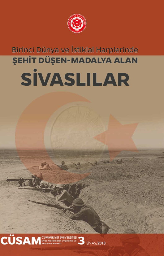
Birinci Dünya Ve İstiklal Harplerinde Şehit Düşen Madalya Alan Sivaslılar
Yazar

STOKTA
25 adet
120.00 ₺
Yayın Bilgileri
Yayın Yılı:
2018
ISBN:
9786054561599
Yayın Tipi:
Basılı
Dil:
Türkçe
Yayınevi:
Cumhuriyet Üniversitesi Yayınları
Baskı Bilgisi:
1. Baskı
Sayfa Sayısı:
295 sayfa
Aynı Kategoriden Diğer Yayınlar
STOKTA YOK
100.00 ₺
STOKTA YOK
600.00 ₺
STOKTA YOK
200.00 ₺
Yazarın Diğer Yayınları
STOKTA YOK
120.00 ₺
STOKTA YOK
120.00 ₺